Bootstrap Grid Layout (Span Rows?)

I am working on a Boostrap v3 project that requires a responsive infographic style page.

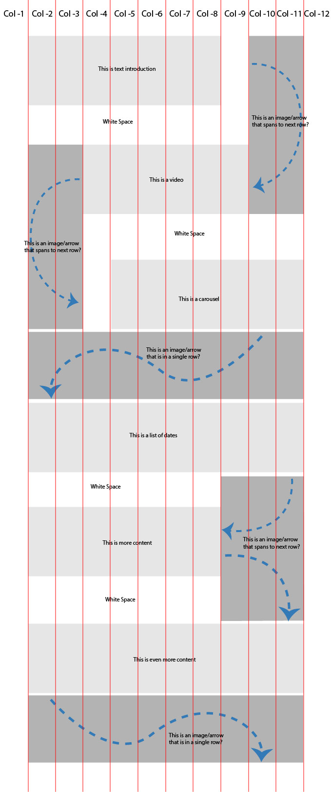
I cannot figure out how to do this the way i need to. I have had limited success in spanning a single row but cannot get the layout working the way it needs (shown in the picture with this post).

Read More

Does anyone have a suggestion on how to achieve the desired layout pictured please? (if it is even possible bootstrap grid layout).

Desired Layout of Page

Related posts

Leave a Reply

2 comments

  1. It’s my attempt. Please check: http://codepen.io/glebkema/pen/LZRjNg

    @import url('https://maxcdn.bootstrapcdn.com/bootstrap/3.3.6/css/bootstrap.min.css');
    
    img {
      height: auto;
      width: 100%;
    }
    
    .container {
      margin-bottom: 10px;
    }
    .row > div {
      margin-top: 10px;
      padding: 0;
    }
    
    .content {
      background: #ddd;
      padding: 20px 15px 120px;
    }
    
    .spaces {
      margin-bottom: 80px;
      margin-top: 80px;
    }
    .space-both {
      padding-left:  16.66666667% !important; /* of the page width */
      padding-right: 16.66666667% !important; /* of the page width */
    }
    .space-right {
      padding-right: 25% !important; /* of the page width */
    }
    
    .arrow-both {
      height: calc(100% + 160px) !important;
      position: absolute;
      right: 0;
      top: -80px;
      width: 30% !important; /^ of the block width */
    }
    .arrow-down,
    .arrow-up {
      height: calc(100% + 80px + 50%);
      position: absolute;
      width: 20%; /^ of the block width */
    }
    .arrow-down {
      left: 0;
      top: 0;
    }
    .arrow-up {
      bottom: 0;
      right: 0;
    }
    <div class="container">
      <div class="row">
        <div class="col-xs-7 col-xs-offset-1">
          <div class="content">
            <h2>Introduction</h2>
            <p>Text text text text text text text text text text text text text text text text text text text text text text text text text text text text text text text text text text text text text</p>
          </div>
        </div>
      </div>
      
      <div class="row spaces">
        <div class="col-xs-10 col-xs-offset-1 space-both">
          <img class="arrow-down" src="//placehold.it/200x800/666/fff/?text=Arrow" alt="">
          <img src="//placehold.it/640x512/c69/fff/?text=Video" alt="">
          <img class="arrow-up" src="//placehold.it/200x800/666/fff/?text=Arrow" alt="">
        </div>
      </div>
      
      <div class="row">
        <div class="col-xs-7 col-xs-offset-4">
          <img src="//placehold.it/800x400/69c/fff/?text=Carousel" alt="">
        </div>
        <div class="col-xs-10 col-xs-offset-1 no-padding">
          <img src="//placehold.it/900x150/666/fff/?text=Arrow" alt="">
        </div>
        <div class="col-xs-10 col-xs-offset-1">
          <div class="content">
            <h2>List of dates</h2>
            <p>Text text text text text text text text text text text text text text text text text text text text text text text text text text text text text text text text text text text text text</p>
          </div>
        </div>
      </div>
      
      <div class="row spaces">
        <div class="col-xs-10 col-xs-offset-1 space-right">
          <div class="content">
            <h2>Content</h2>
            <p>Text text text text text text text text text text text text text text text text text text text text text text text text text text text text text text text text text text text text text</p>
          </div>
          <img class="arrow-both" src="//placehold.it/400x800/666/fff/?text=Two%20arrows" alt="">
        </div>
      </div>
      
      <div class="row">
        <div class="col-xs-10 col-xs-offset-1">
          <div class="content">
            <h2>More content</h2>
            <p>Text text text text text text text text text text text text text text text text text text text text text text text text text text text text text text text text text text text text text</p>
          </div>
        </div>
        <div class="col-xs-10 col-xs-offset-1 no-padding">
          <img src="//placehold.it/900x150/666/fff/?text=Arrow" alt="">
        </div>
      </div>
    </div>
  2. I think You can create a div container with all 12 grid element and then create a table inside that div.

    in table using colspan and rowspan you can find your desired functionality.